CVMaker is an online platform that helps job seekers create professional CVs and Cover letters with ease. With 30+ domains and 11M monthly active users, CVMaker supports a global audience in advancing their careers.
Company
CVMaker
Contribution
Design, Research, Experiments, Strategy
Industry
SaaS, B2C
Year
2023 – 2025

TL;DR
Conversion leaked at template choice and signup. I reframed the work to “reduce time-to-value,” then sequenced wins: stabilize ~50 UI components, simplify onboarding, defer signup to test the tool (anonymous flow), and layer trust + momentum (AI rewrite, stepper, transparent paywall, and post-creation cues).
Results: +38% free→trial, +56% other-tools usage, and Day-3 retention went from ~1% to 8%.
Context
CV Builder is the first touchpoint with the product. It lets users create a CV from scratch, customize a template, improve structure, and export a ready-to-use CV. This tool should engage users and naturally lead them to explore other features of the platform.
I joined as the first in-house designer to stabilize the experience and focus on growth after a previous redesign under-performed.
Business goal
Transform CV Builder from a leaky first-touchpoint into a growth engine that converts, retains, and expands usage across the job-search journey.

What were the complications when I joined the product:
Low conversion to subscription
Numerous bugs and sub-optimal UX
No straightforward process, no clear requirements, and no backlog
Lack of understanding in the team about who our users are

That’s how it felt. Nevertheless, I started to dive in.
Discovery & insights
I ran a discovery process with a tight aperture on evidence we could trust at scale:
Hotjar session review: users hovered, scrolled, and bounced at the template wall—the first decision felt risky.
Analytics: the signup page was our biggest leak, with 59% drop-off, and the template selection step was the second biggest leak.
Interview attempts: I sent about 10,000 invites, people wanted the free CV review but not a call, and no-shows were high. Combined with day-3 retention around 1%, it was clear this was a one-shot, high-stress use case. I proposed focusing on what we already had – our data.
Learning
We were forcing users to make big commitments – pick a template, create an account, fill out the long form – before they could see any value. So I reframed the work around activation and reducing time-to-value.

Design strategy
With PM, I ran workshops to define a strategy using Aaron Walter’s hierarchy — make it work, usable, then delightful — and prioritized a roadmap we could test in slices. We kept a decision log that recorded hypotheses, rationale, agreed risks, and sunset criteria.

Aaron Walter's Hierarchy of User Needs.
Stage 0 – Stabilize the foundation
Functional/reliable
Core experience bottleneck: Interaction with CV sections and inputs limits activation and retention; without improving the core “create CV” experience, personalization and onboarding fixes won’t stick.

I audited and updated ~50 core components to fix critical bugs, improve accessibility (contrast, keyboard focus, error states), and stabilize performance. This reduced surprise breakage and made later experiments trustworthy.


It gave us about +0.5% free-to-trial and a +7% completed CV.
Stage 1 – Anonymous account
Usable
Finding the right moment. Previously we asked users to create an account before they tested the tool — and lost 59% of potential subscribers. The second biggest leaking point was the "Select template" step with no recommendations.

The new version offered 3 starting points, and the new version suggested templates by role and experience. And yes, we start to ask users to create an account only when they are ready to download their CV.


It was a first real win: +11.3% free-to-trial and a 5.5% reduction in time-to-complete CV. "Continue with Google" compensated for users lost in the anonymous flow and added +8% in sign-ups, with statistical significance reached in 3 days.
Stage 2 – Paywall and pricing
Walter's hierarchy doesn't cover pricing. This stage is off the map.
The payment page sits one step before revenue. It moves the number faster than anything else in the flow, and it's the cheapest place to lose trust.
The old page hid what mattered. Refunds were high, support saw the same complaint every week, and Trustpilot sat at 3.7.
Auto-renewal buried in grey text below the button
The real subscription price wasn't visible
No plan choice — one option for everyone
Copy didn't speak to the moment of paying
I had to state billing clearly, avoid dark patterns, and not hurt trial conversion. Those 3 pull against each other.
I tested in small batches. Copy, then layout, then structure — one variable at a time. Some versions worked, some didn't: a sidebar layout split attention and lost. None of it moved conversion much.


The page got clearer, though, and that showed up elsewhere. I argued to judge it on refunds, cancellations, tickets, and LTV, not on a two-week conversion readout. Billing complaints dropped and Trustpilot moved from 3.7 to 4.4.
But we hit a ceiling. Each test gave a small lift. None of it fixed retention or the complaints underneath — because the problem wasn't the page, it was the offer.
Users kept a subscription for ~2 months and 23% re-subscribed after a break. A monthly-only plan pushed them into a cancel–rejoin loop. I proposed exploring multiple plans and led the concept with PM and Finance — I owned the segmentation, plan structure, and flow, they built the revenue model.

We shipped it the same way — several variants, several rounds of testing. I recommended reusing the existing layout for the first test, so pricing logic and visual change wouldn't be measured as one variable.
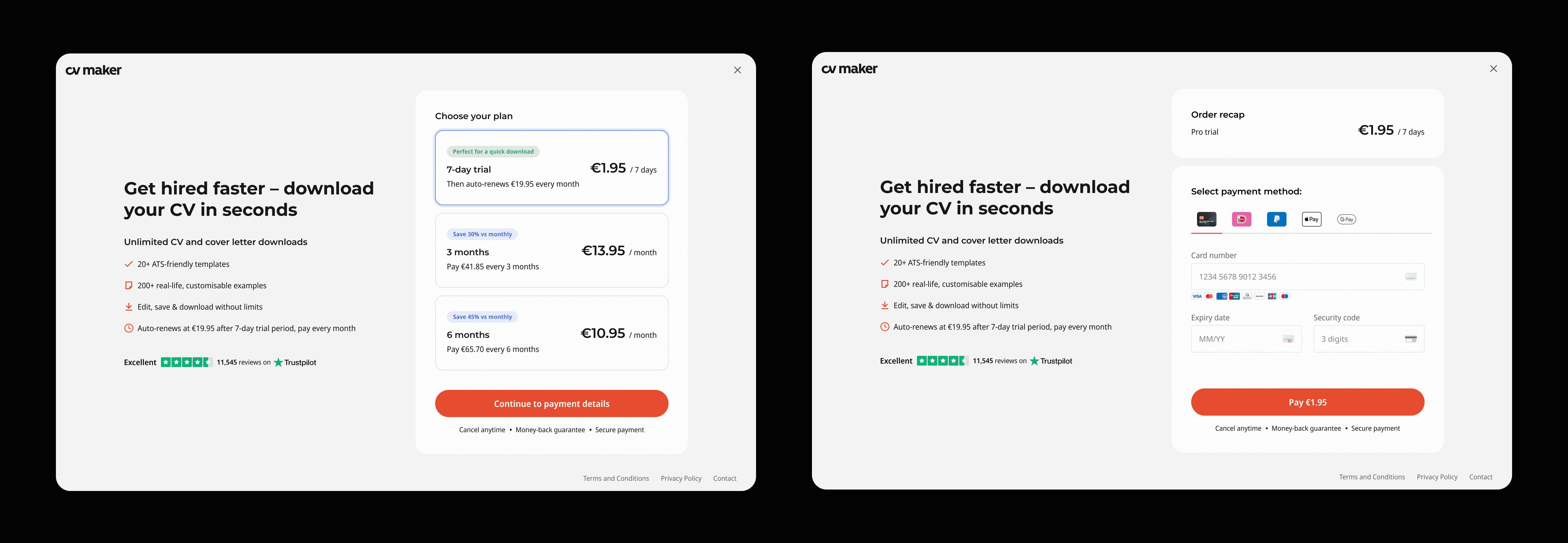
3 plan lengths matched to three job-search mindsets — a tier structure built on behaviour, not on price points.
Result: +24.7% free-to-trial. Tested on UK, then rolled out across the rest.
Stage 3 – Faster to finish
Usable
Stage 0 fixed the components. This stage fixed the work itself — how long it takes to build a CV and how it feels while you do it.
The form was one long page. People stalled on the blank text fields and dropped out before they had anything worth paying for.
A guided stepper. I split the form into short steps with visible progress and what each section adds to the CV. Less to hold in your head, and a reason to finish the next one.


AI content assist. A "Magic Wand" that rewrites and improves the text you've written. It turned the hardest part of the job — writing about yourself — into an edit instead of a blank page. It was free for everyone, and it became the aha moment people bought for: they saw the improved CV, then hit the paywall.

Learning
Recordings showed people pasting foreign-language text into the rewrite field — they were using it to translate. I scoped multi-language CVs into the roadmap and designed the concept before I left.
Mobile. The stepper made a mobile-first flow possible for the first time, and I adapted the builder around it.

Result: 19.5% reduction in time-to-complete CV, mobile conversion +34%, desktop +7%.
Stage 4 – Beyond the download
Delightful
People downloaded their CV and left. Not because they were done with the job search — they didn't know the platform had anything else. Cover letters, the job board, application tracking: all of it sat behind a menu nobody opened at that moment.
Download is the one moment when the user has just succeeded and is still in the middle of a job search. That's where the next step belongs, not in navigation.
